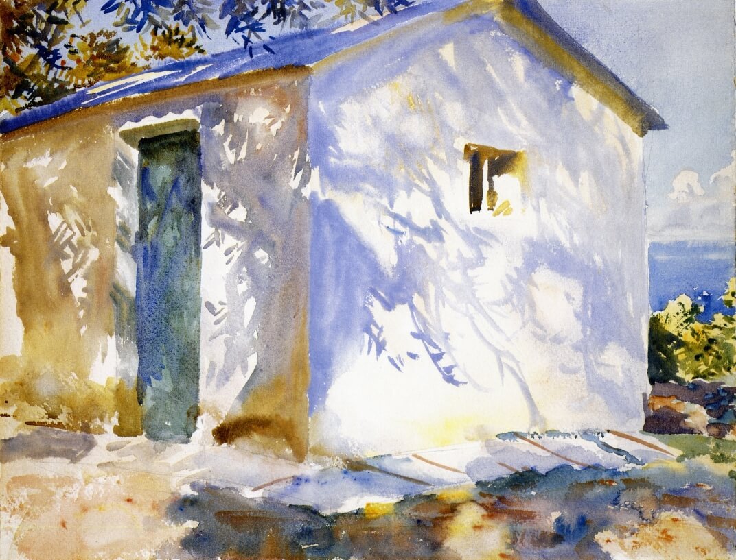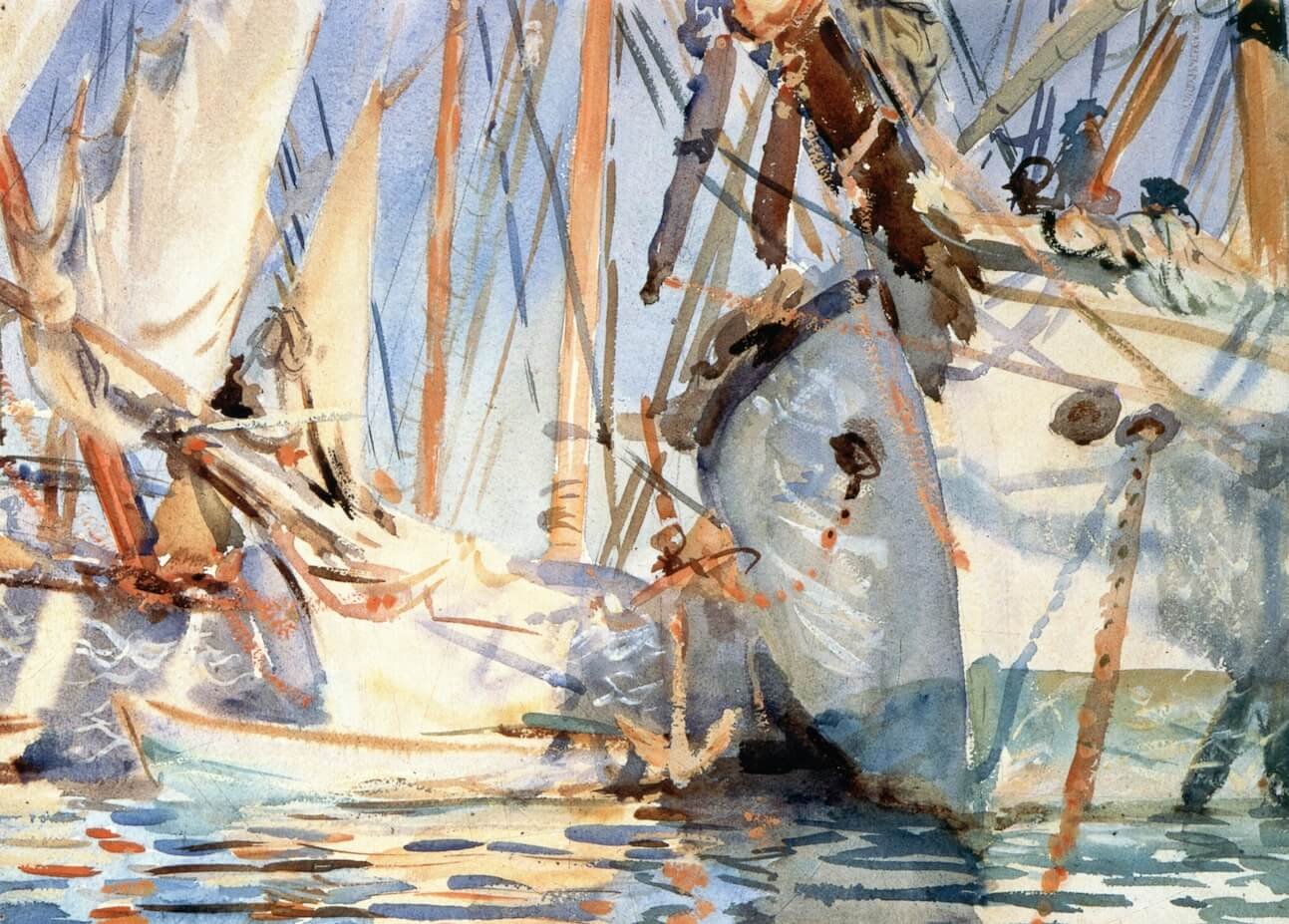
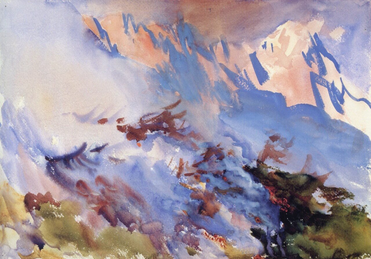
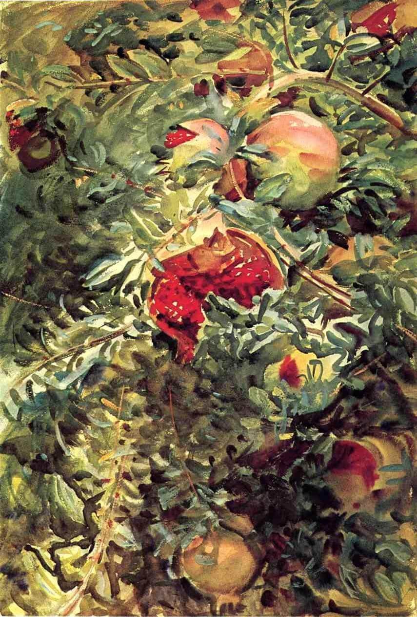
This post contains a selection of eleven watercolors from the exhibition catalog of John Singer Sargent Watercolors. These works constitute what I hope is a reasonably representative sample of the different styles, techniques, color palates, and approaches to the medium that Sargent used at various times and places.
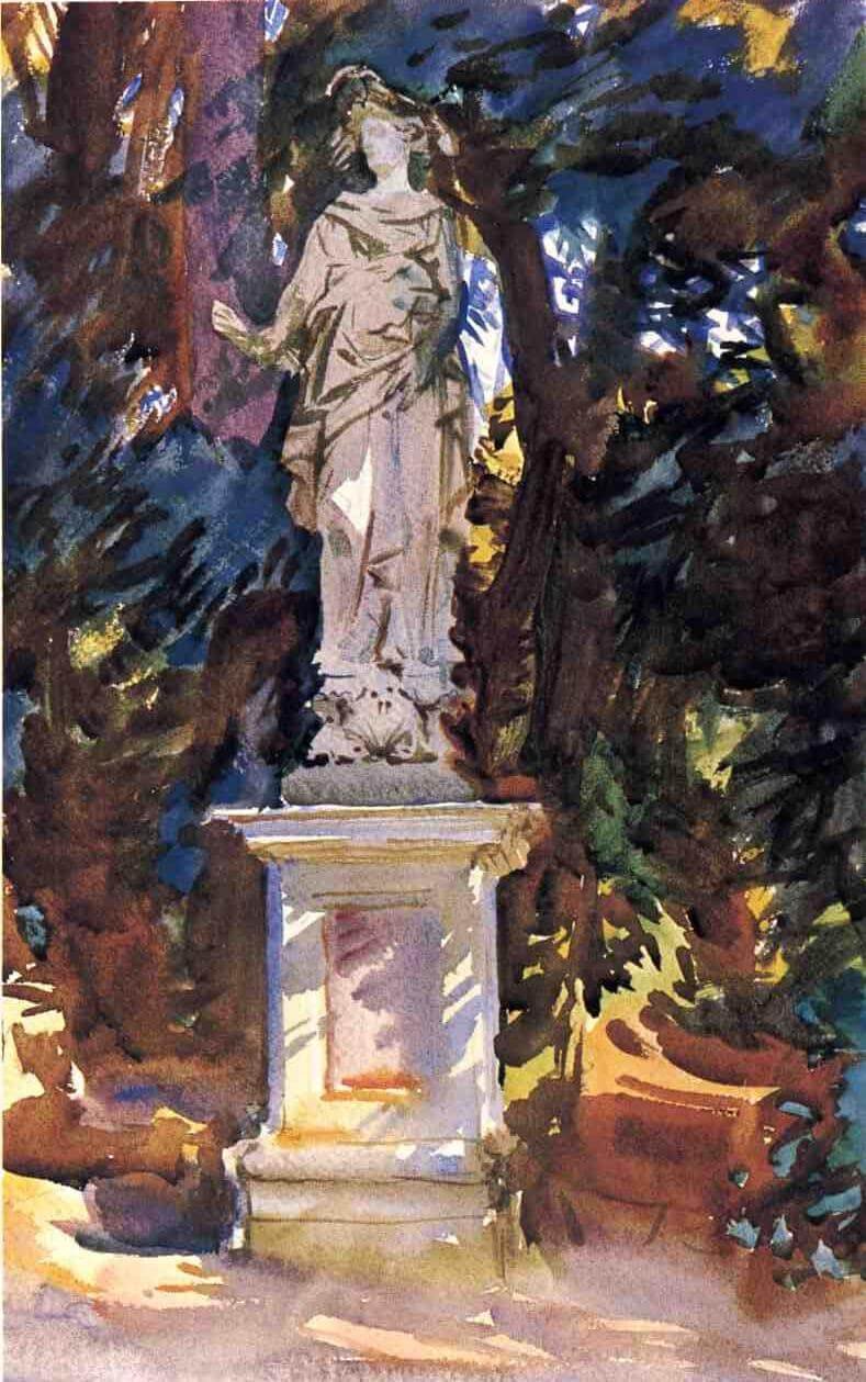
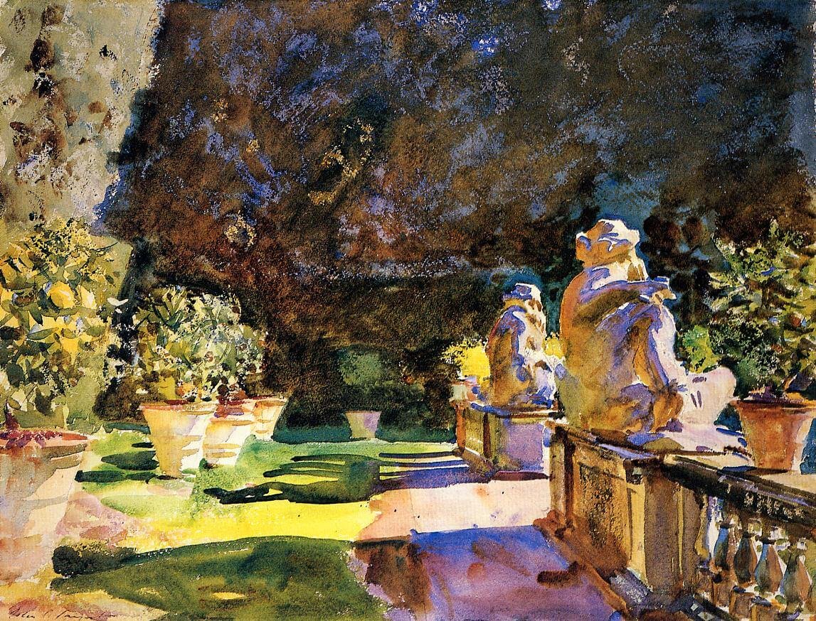
The examples draw from most, but not all, of the categories of Sargent’s most frequent subject matter enumerated in the book, including Carrera quarry scenes, boats, statuary, Italian gardens, and so forth. They are also among the pieces I feel are most visually effective.
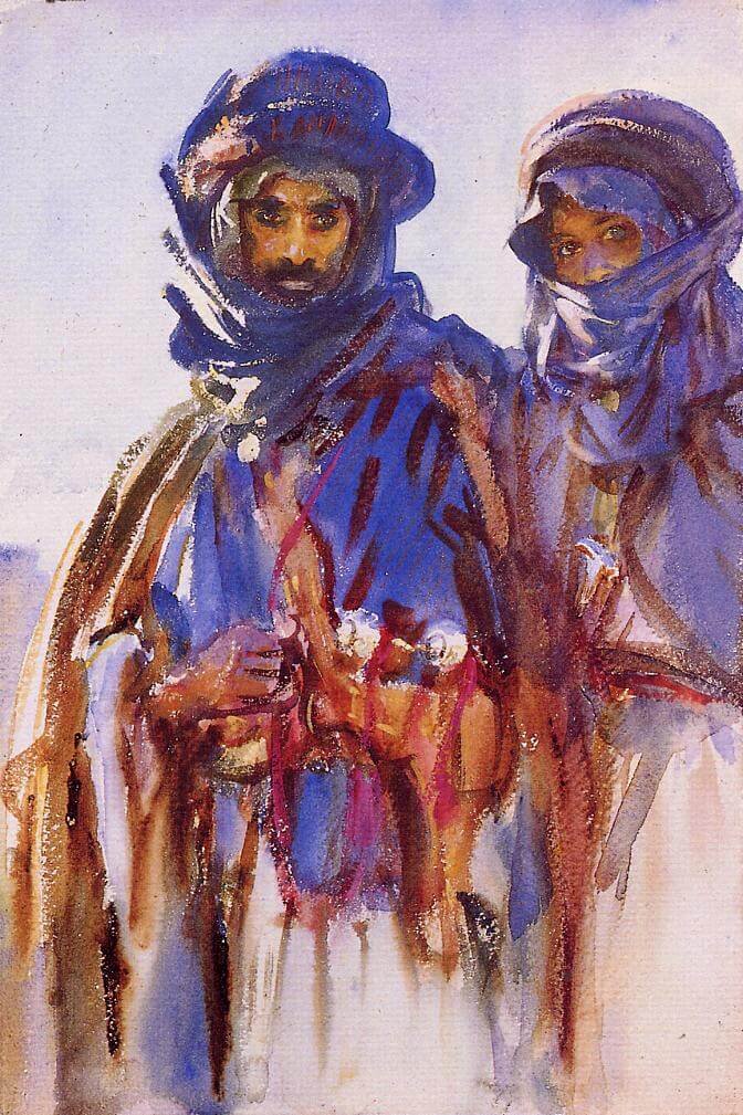
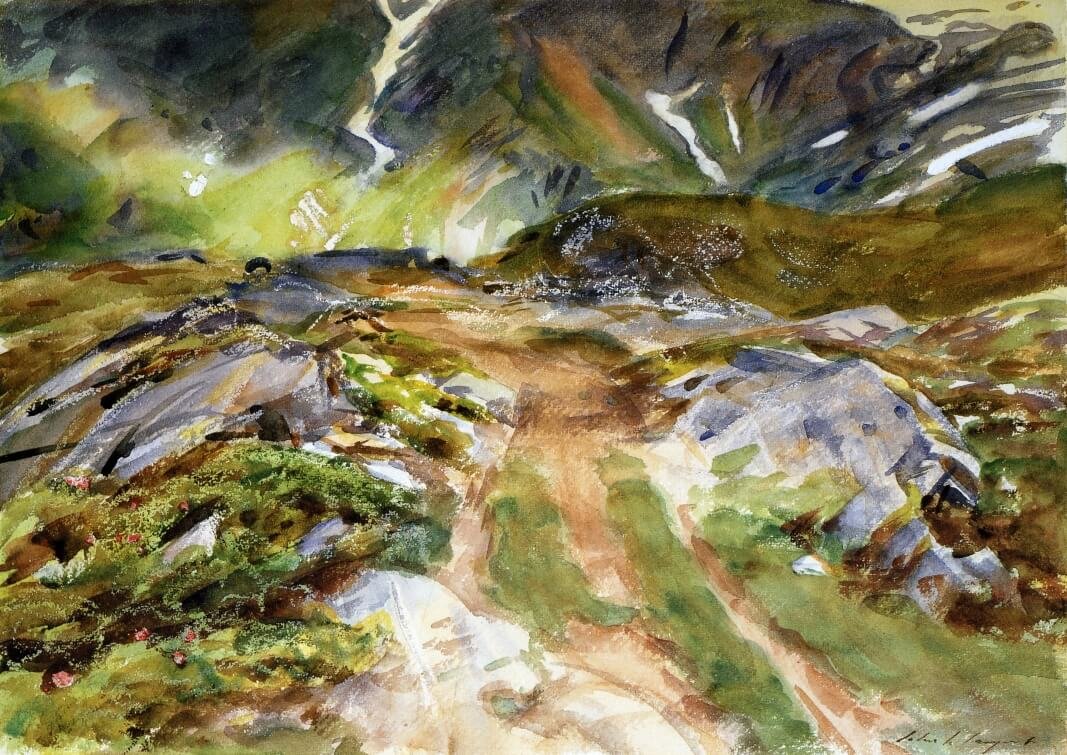
I enjoyed some of Sargent’s watercolors more than others. I found some to be exciting, dynamic, and innovative, while others seemed somewhat insubstantial in color, composition, or line. It is not that I necessarily prefer the more detailed works; in fact, some of the most detailed watercolors were among my least favorites because they often gave little sense of personality or place.
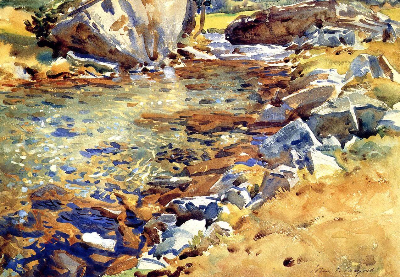
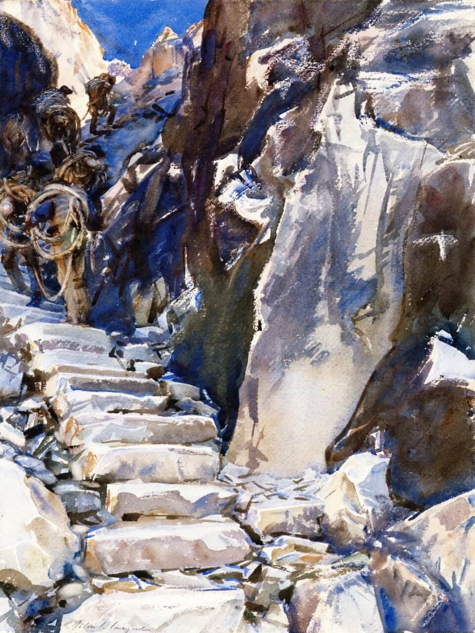
I found that the most effective works tended to be quite complex in terms of the types of brushstrokes and the juxtaposition of marks, forms, and lines, but they were not particularly heavy in mimetic detail. They also made use of the vibrant colors, varying textures, strong contrasts of both color and brushstrokes, and semi-abstracted but still comprehensible forms. They tended not to include large areas of white paper or thick strokes of uniform color, especially of the lighter tones.
John Singer Sargent Watercolors was on view at the Museum of Fine Arts Boston from October 13, 2013 – January 20, 2014, but you can see these gorgeous works any time in the exhibition catalog. Hirshler, Erica E. and Teresa A. Carbone. John Singer Sargent Watercolors. Boston: MFA Publications, 2013. At the end of the book is a lengthy discussion of Sargent’s watercolor techniques, including examples of the effects of each one, which I found to be particularly interesting.